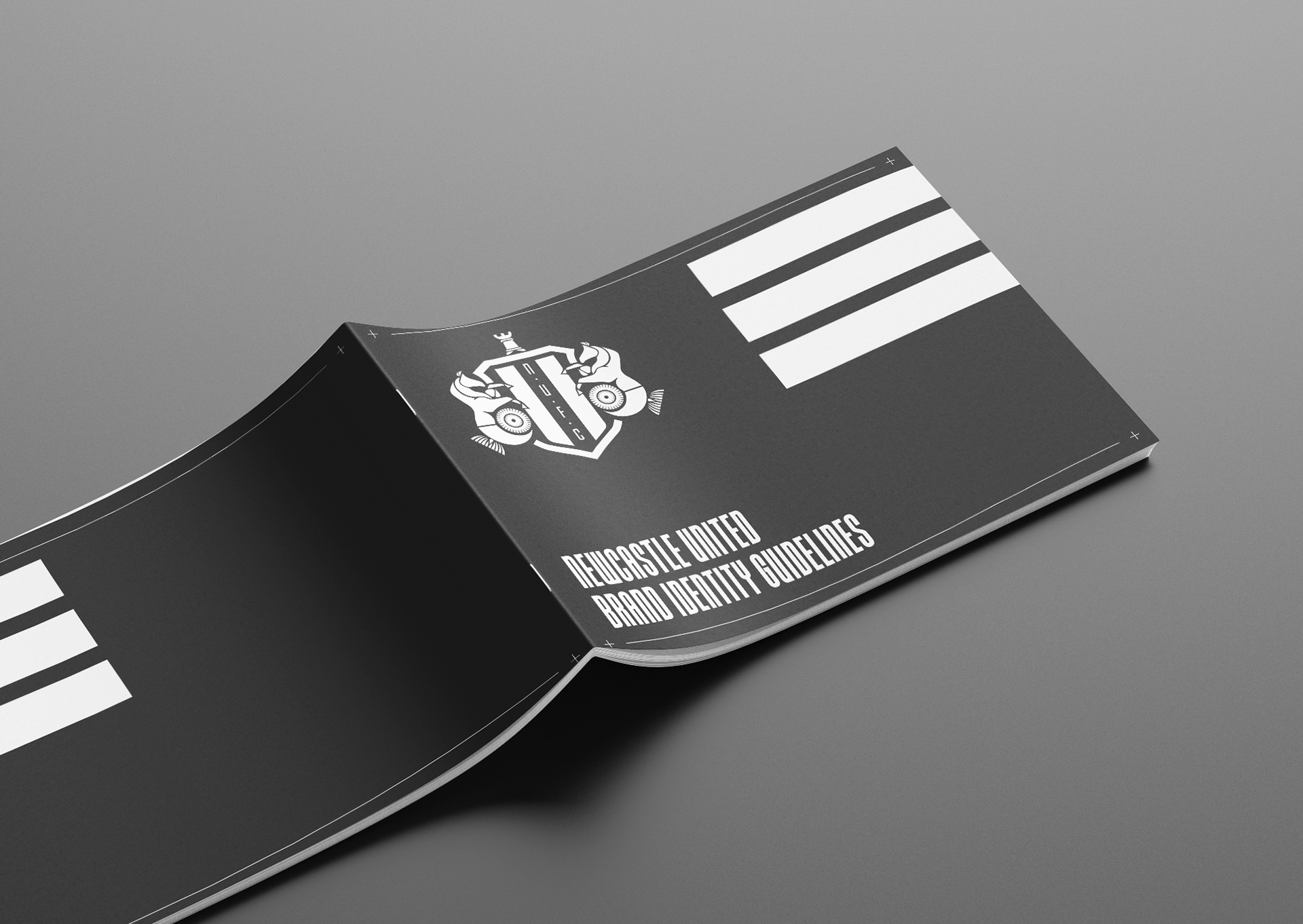
Project Outline
A major project in my final year of study at Liverpool John Moore University was the rebrand of Newcastle United Football Club. The aim of the rebrand was to improve the club identity through more graphic outputs. Through this the club would continue to appeal to the current fanbase whilst reaching out to a younger audience. A major component of the rebrand was redesigning the historic badge whilst keeping it's iconic symbolism
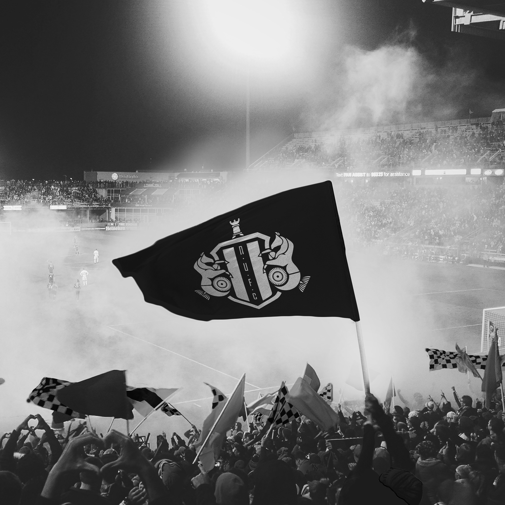
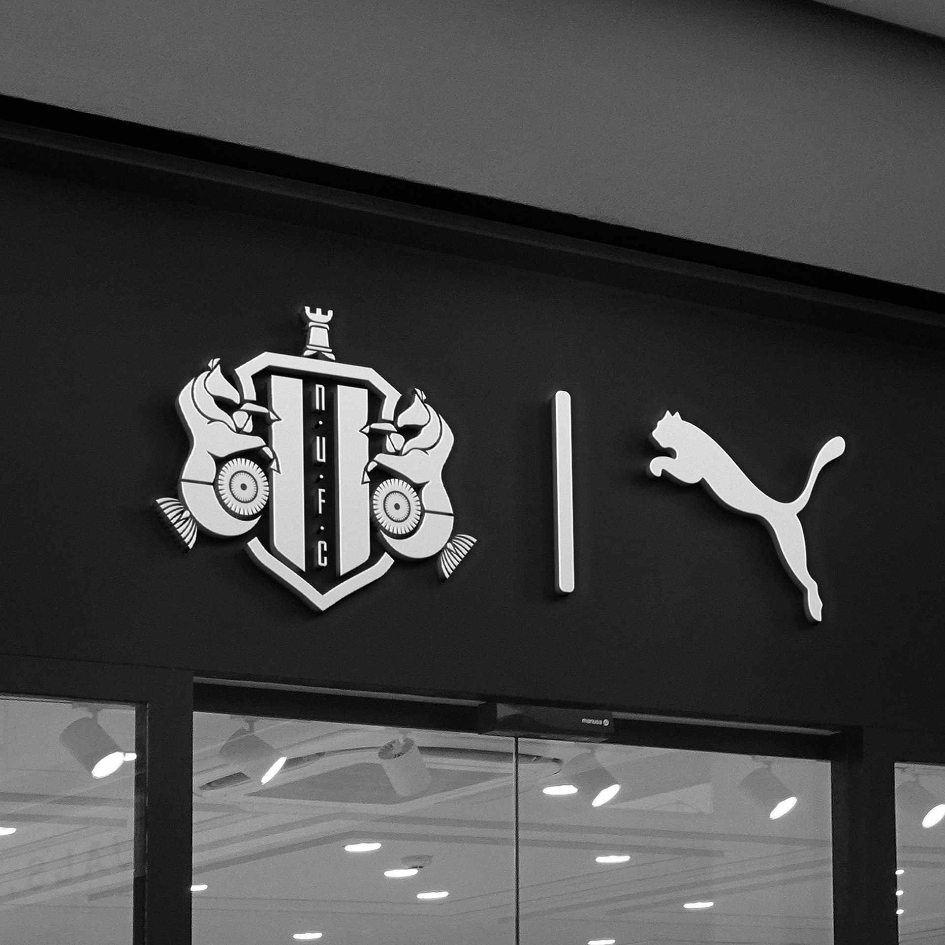
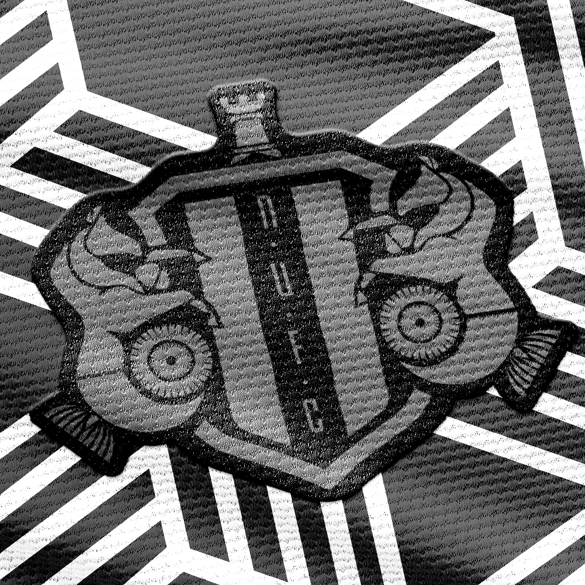
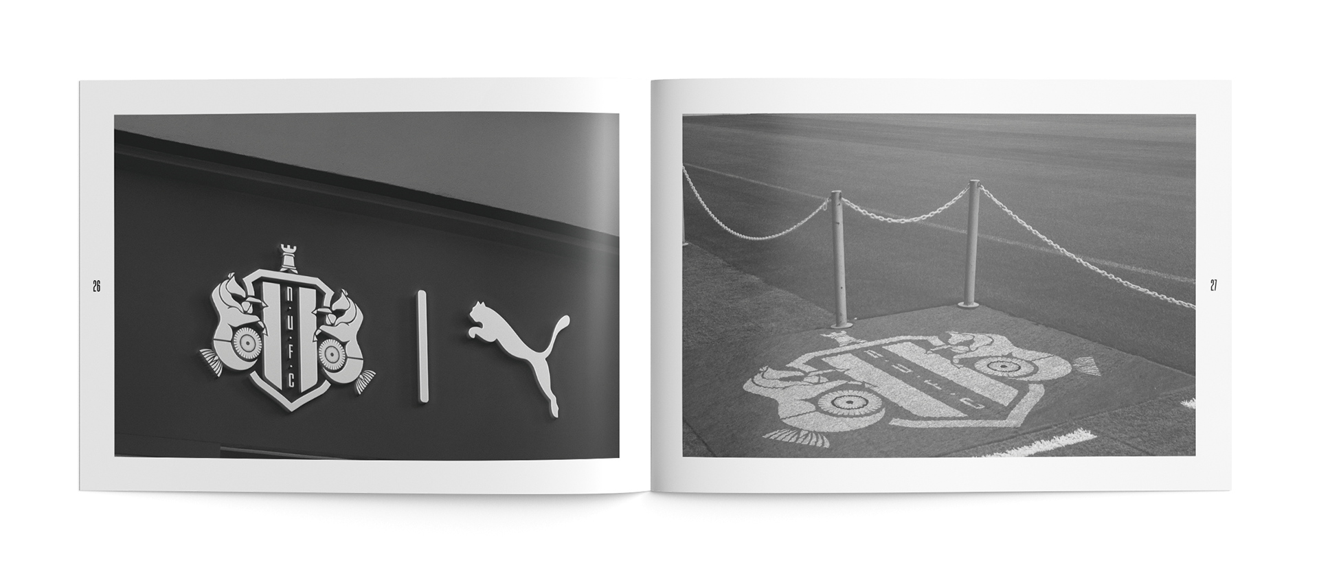
BADGE REDESIGN
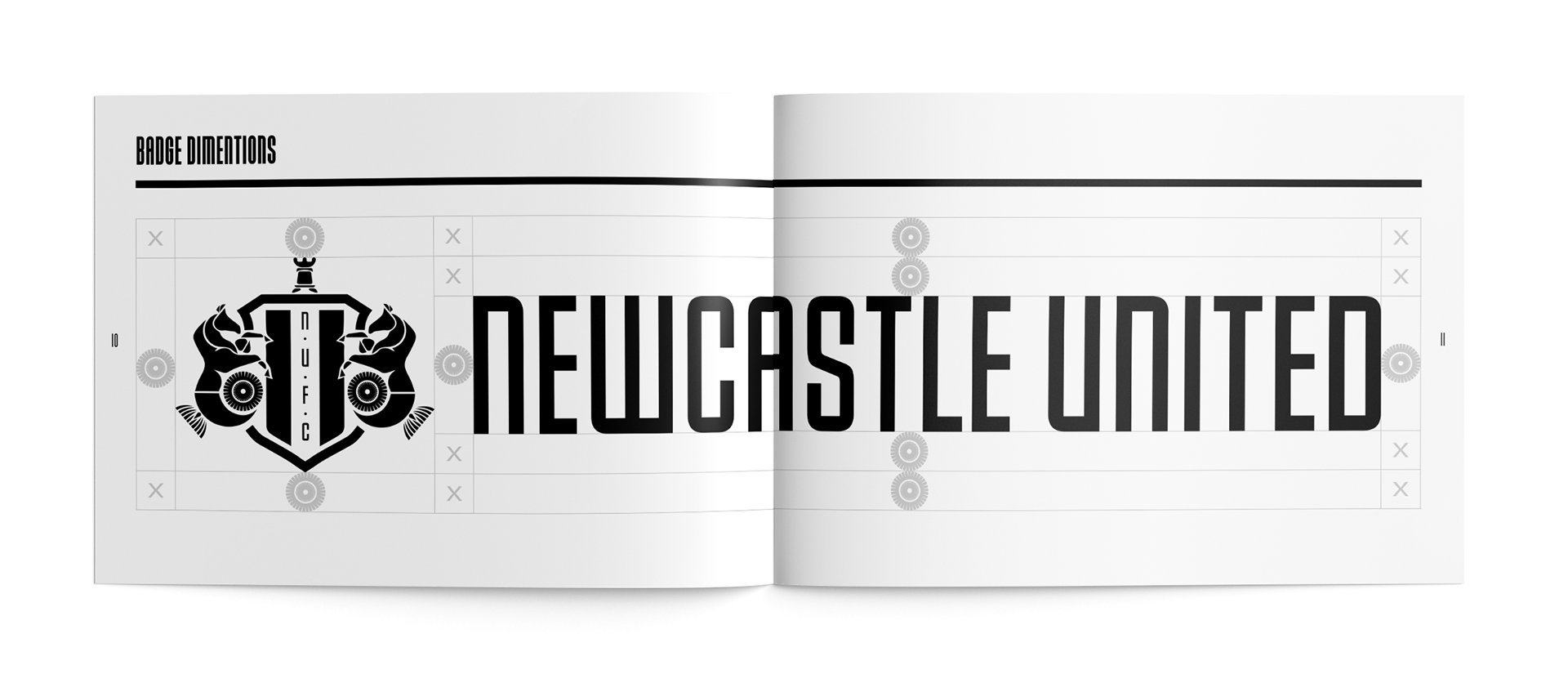
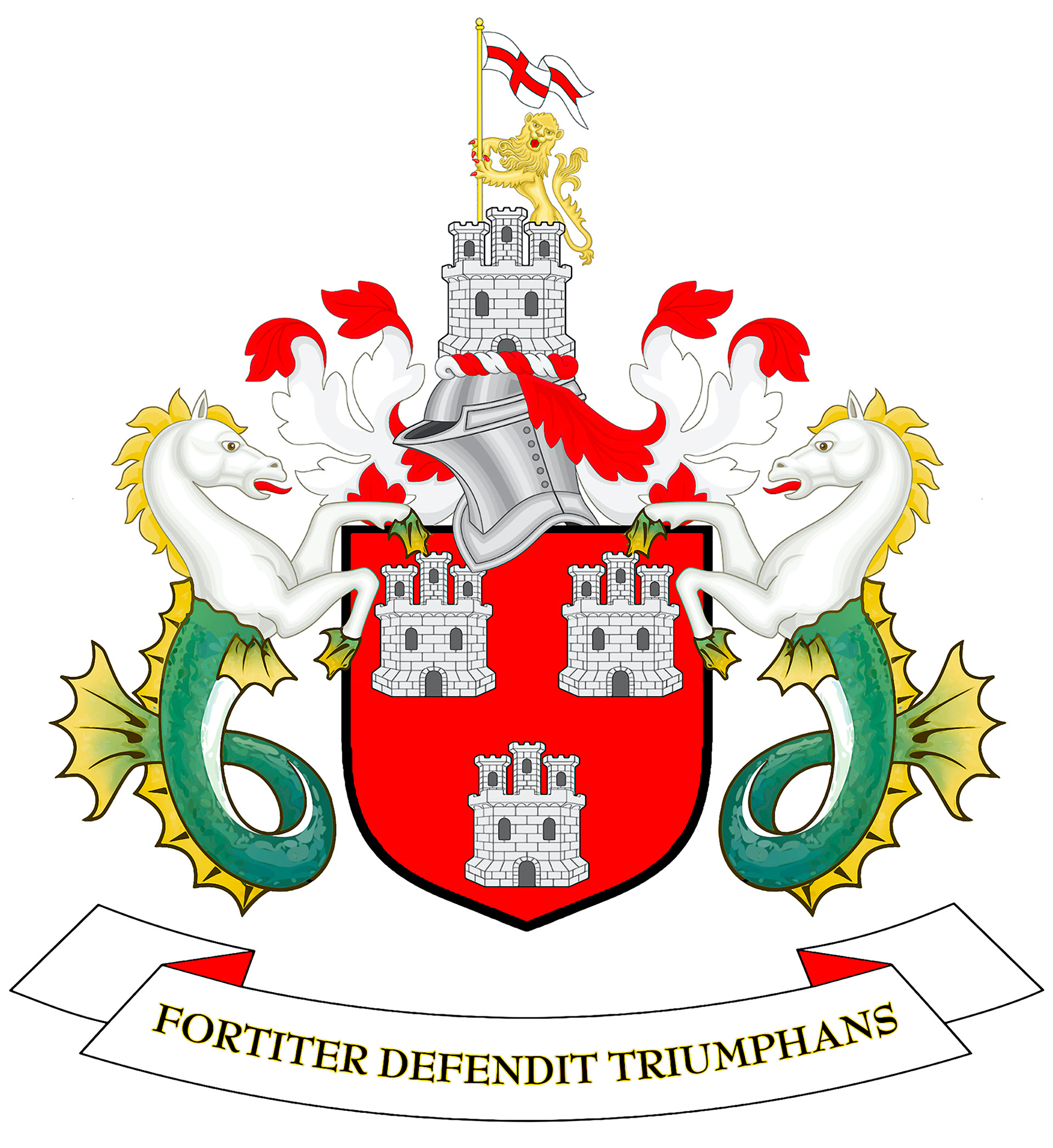
A major component of the rebrand was redesigning Newcastle United's badge. Shown below on the left are the clubs’ badges from previousyears. When it comes to football fans, familiarity within is important as many would have supported the club from childhood, epicallythose within the hosted city, therefore it was important to keep the features of the previous badge but ensuring modernisation.


COLOUR PALLET
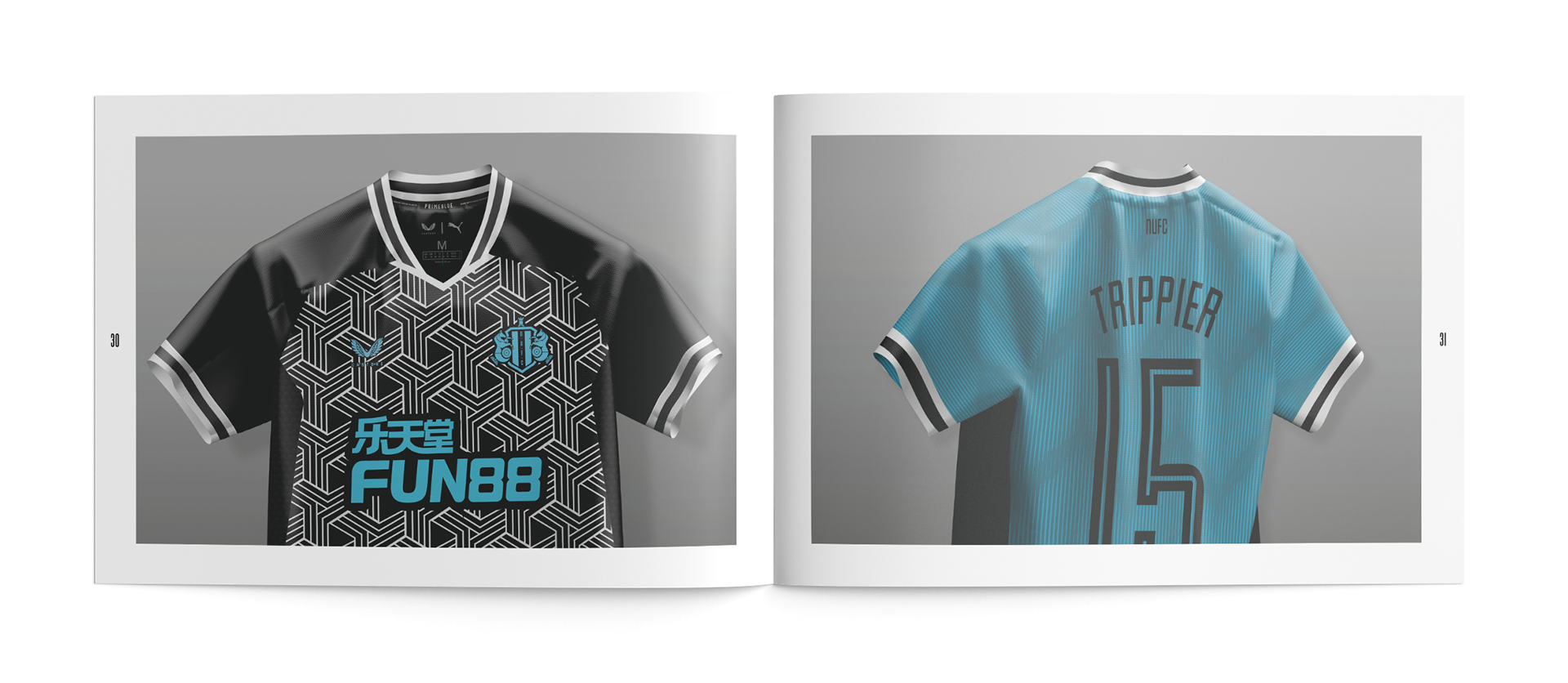
In 1892 a clash of kit colours saw Newcastle United borrow and black and white kit from local rivals Notts County in an away game versus Nottingham Forest. Since that date Newcastle have been associated with black and white, picking up the nickname 'Magpies'. This colour pallet is a huge part of the identity of the club and is the primary colours in the designs made for the project.


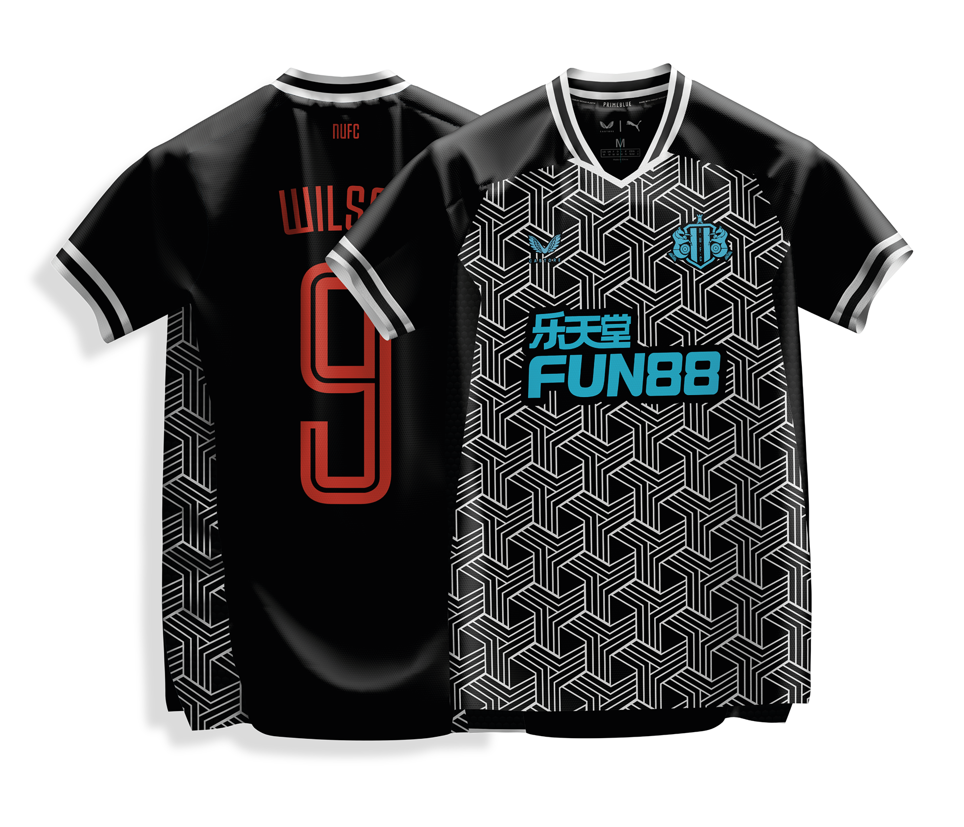
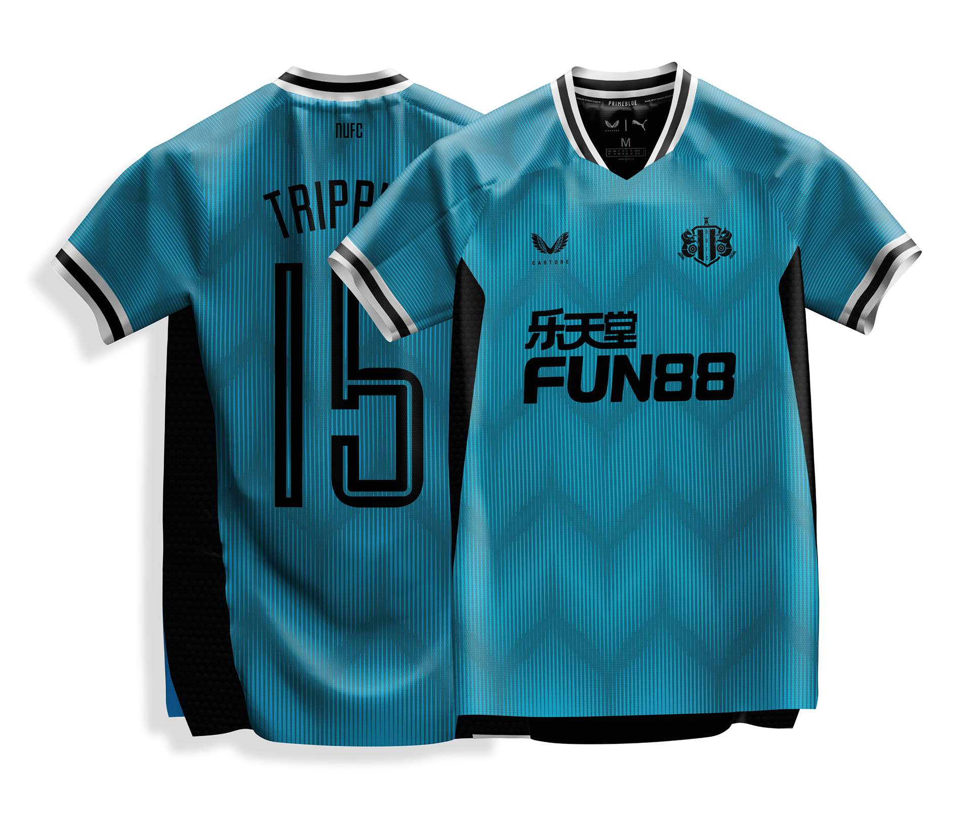
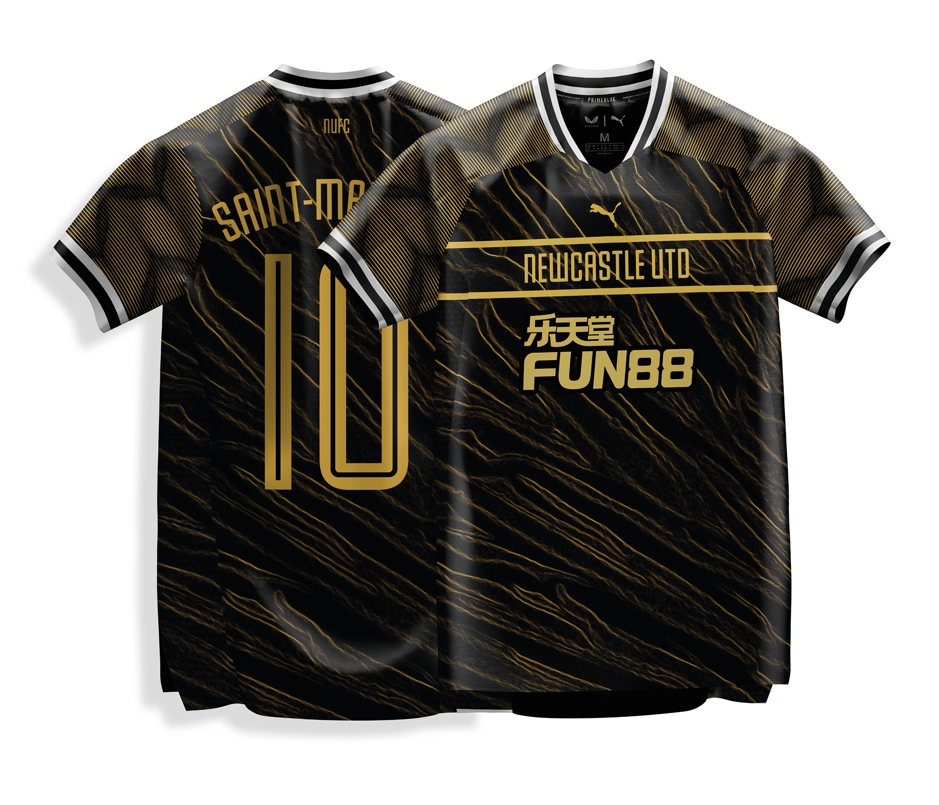
KIT REDESIGN
MATCHDAY PROGRAMME

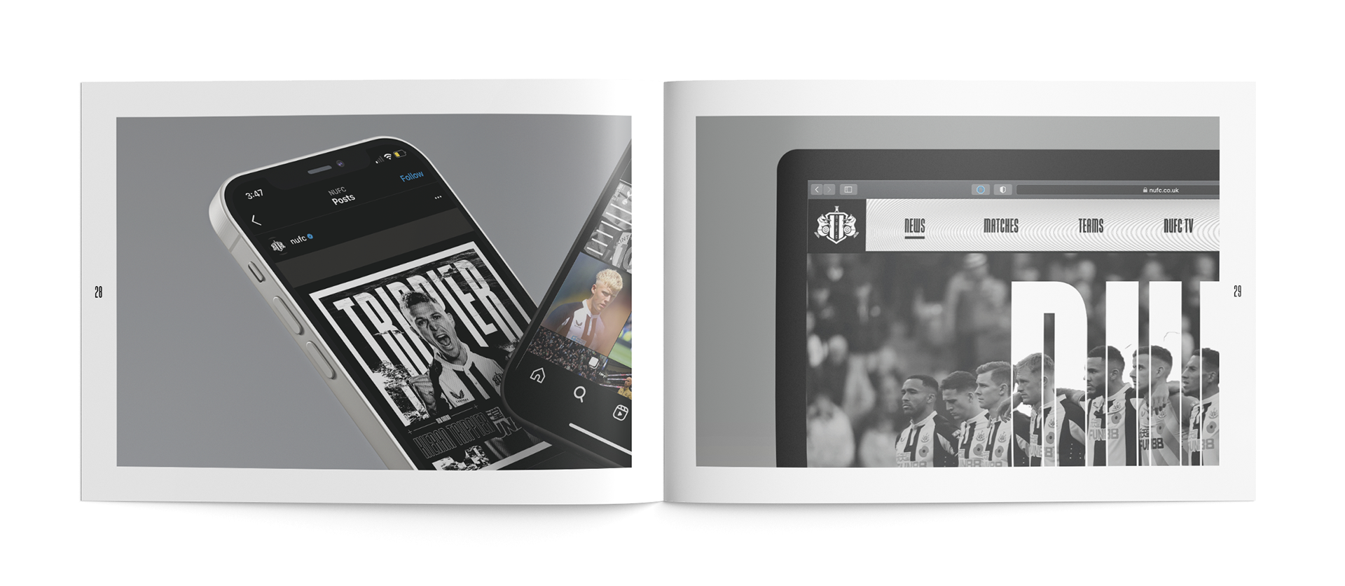
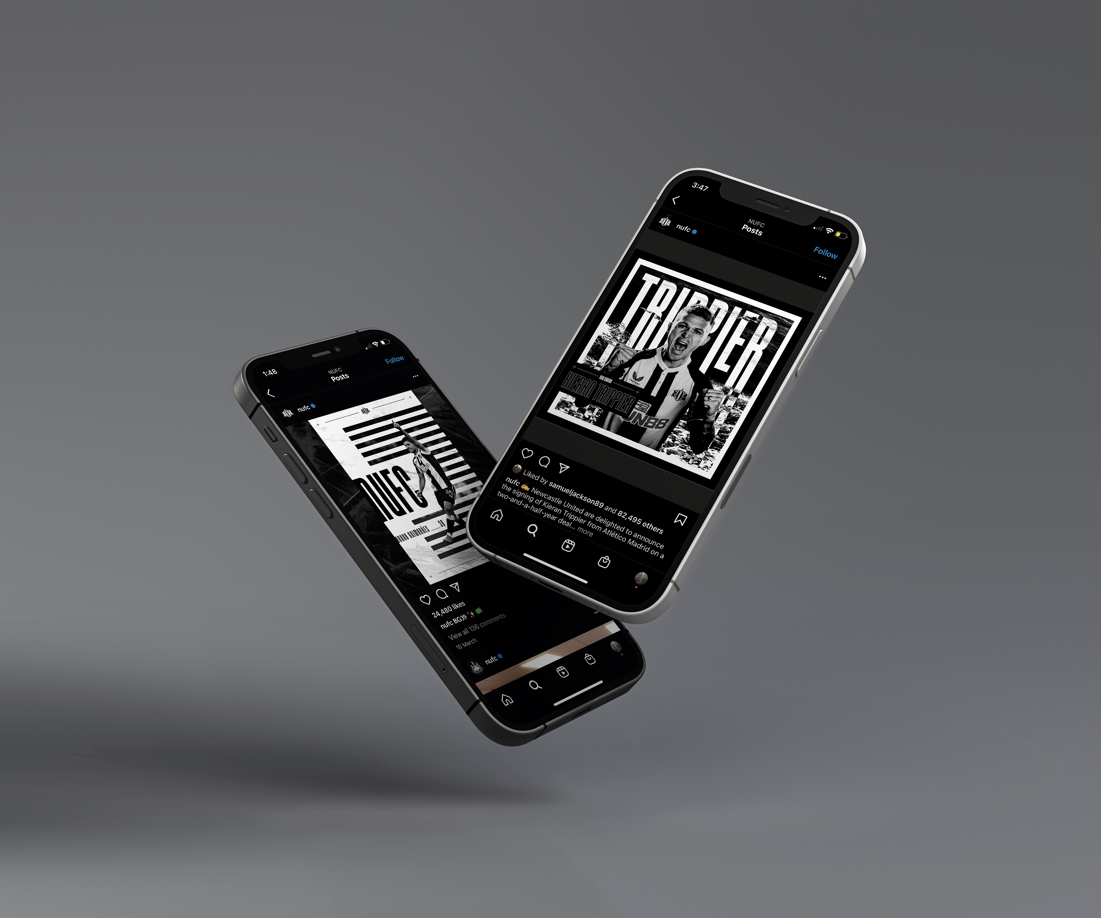
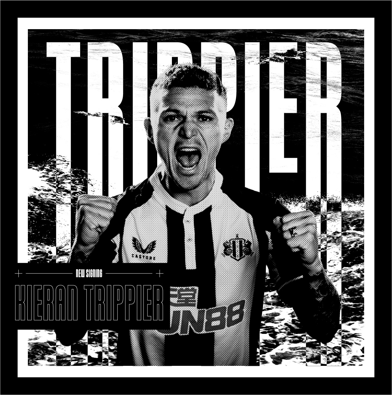
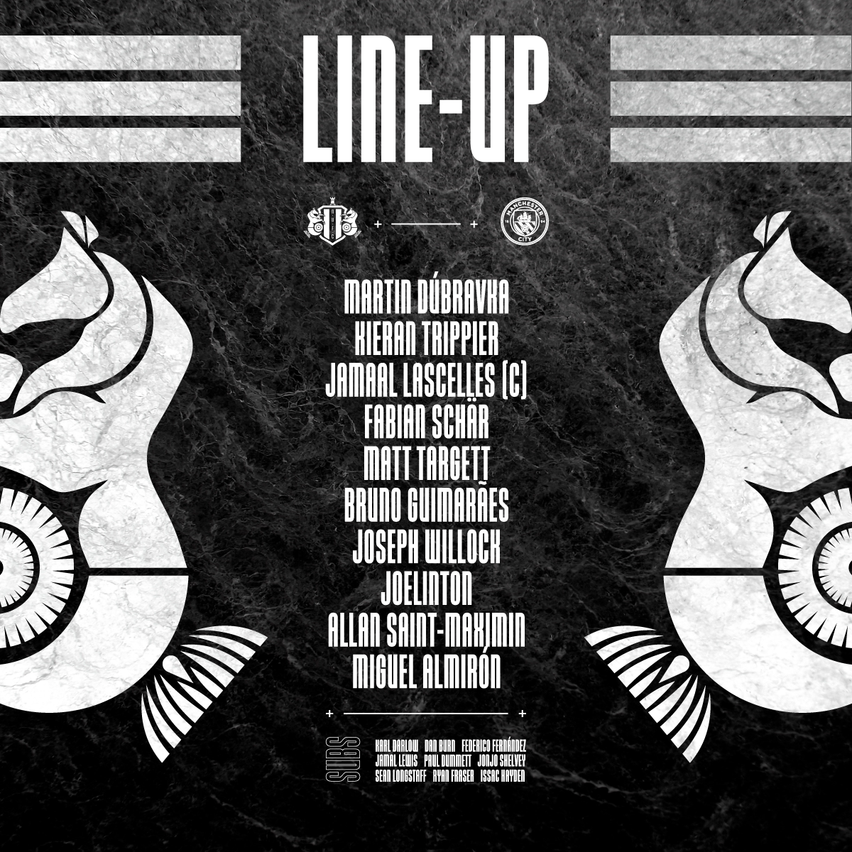
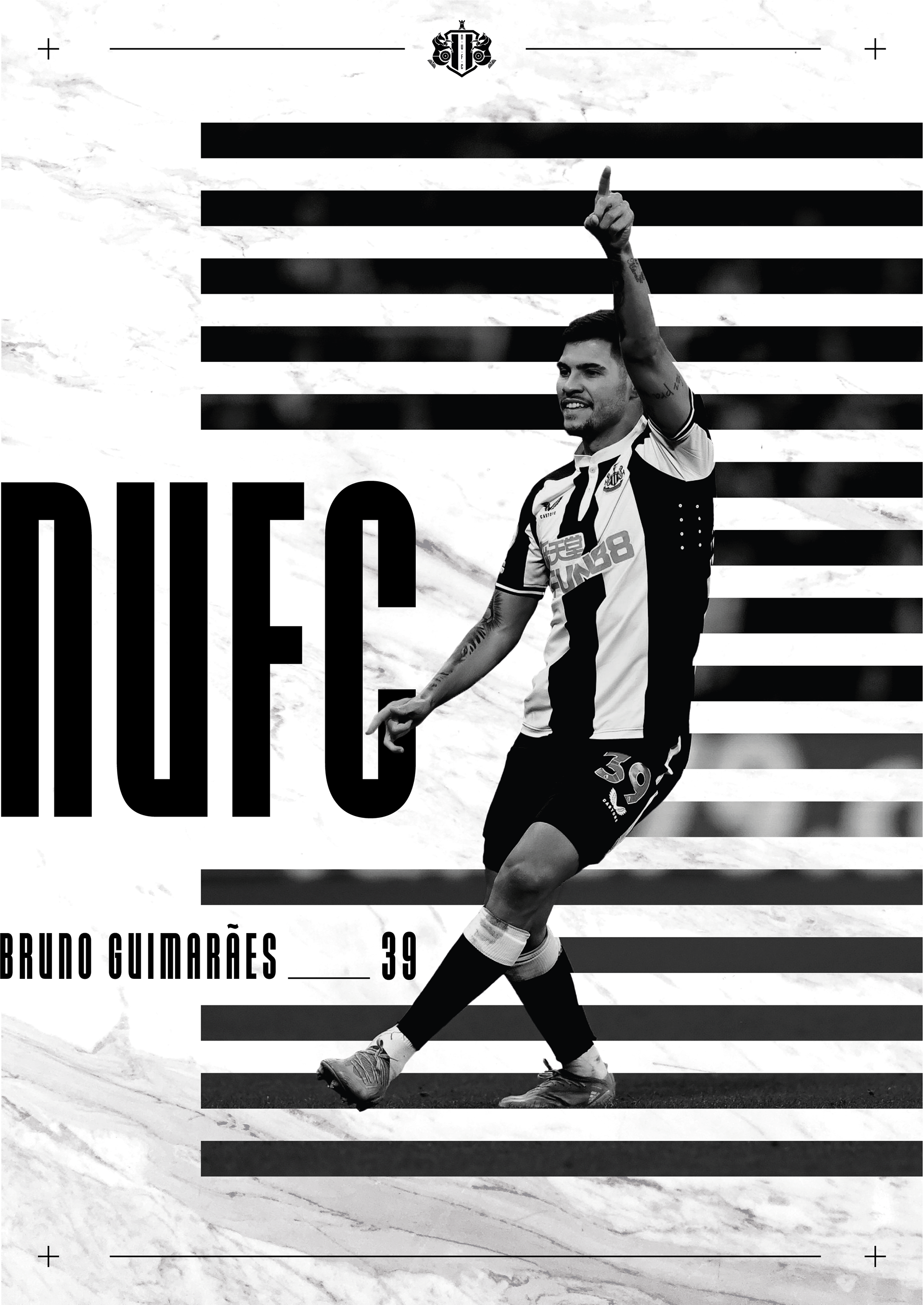
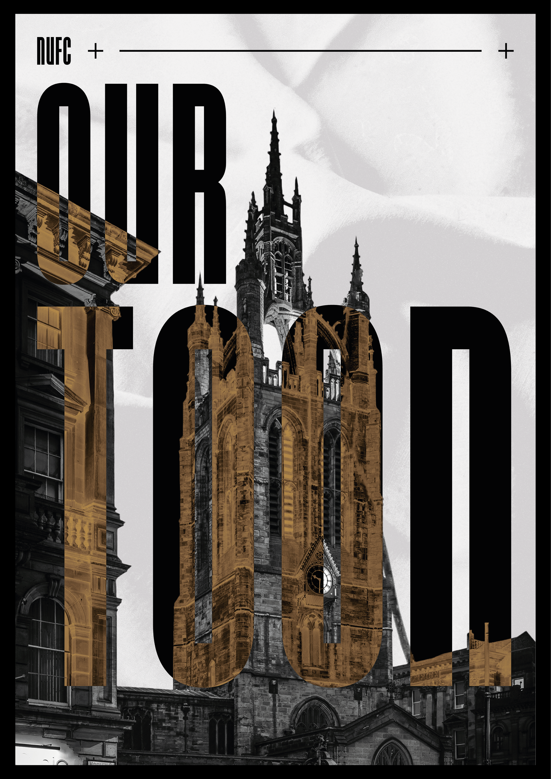
SOCIAL MEDIA DESIGNS
As part of the rebranding project I designed various exemplar material such as social media posts that show the clubs new identity and incorporate a new design style


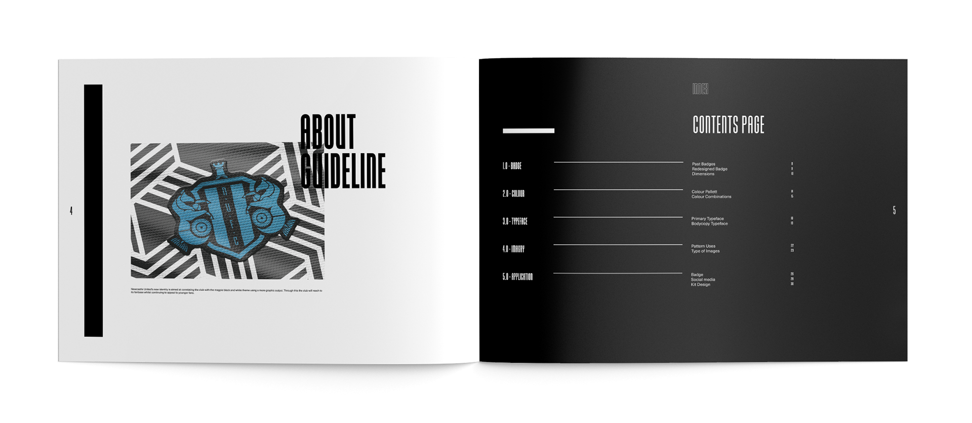
IDENTITY GUIDELINES